Edward Tufte
Hopeless
I have been so spectacularly delinquent in updating this blog that the best approach is simply to ignore my failures and just start posting again.
The Genius and the Procrastinating Moron (guess which one is me)
To wit: I went to a seminar given by Edward Tufte this week.
 Who is this guy?
If you don’t know the name, Wikipedia describes him as a “statistician and professor emeritus of political science, statistics and computer science at Yale University” while also indicating that he is “noted for his writings on information design and as a pioneer in the field of data visualization.”
I first came across him when I saw him quoted in some rant about PowerPoint. He said: “PowerPoint is like being trapped in the style of early Egyptian flatland cartoons rather than using the more effective tools of Renaissance visual representation.” Oh, snap! I’m guessing that idea didn’t make it into the marketing materials out of Redmond, WA.
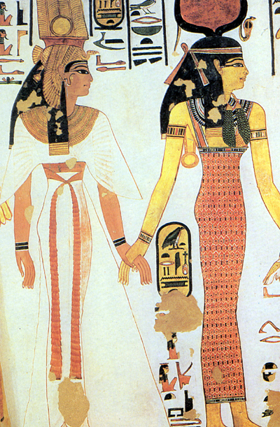
 Hm … which one conveys more information?
I am right there with him on PowerPoint. As my pal Michael McPherson has noted: “Power corrupts. PowerPoint corrupts absolutely, ” riffing on something said by this guy:
 Great quote AND a righteous beard
There are so many problems with PowerPoint and its role in our current meeting culture that it’s hard to know where to begin.
Let’s start with this quote from Steve Jobs: “I hate the way people use PowerPoint instead of thinking.”
 “Bill, you’re a good guy and a true humanitarian, but you still have to answer for PowerPoint.”
Again: Oh, snap!
But he has a power(ful) point. I can’t tell you how many meetings I’ve been to where the meeting consists of … the leader READING the PowerPoint slides!! Well, thanks so much! I couldn’t have done this without you!
So, let’s start there – PowerPoint is not the audience for your meeting. Many, many times I have participated in meeting preparation where we can’t say something or show something because it would wreck the PowerPoint presentation. That’s not just the tail wagging the dog – it’s the tail putting the dog in a tiny little kennel, refusing to feed it or take it for a walk and yelling at it for whimpering.
 “Keep wagging me, motherfucker, and I’ll bite your ass!! Oh, wait …“
My advice: If you have to use PowerPoint, remember these 4 things
If people who give presentations would remember these things, there would be a lot less hate in the world. Trump would still be President (or would he? Bwahahahahahaha!!!!), but the world would be a better (and more productive) place.
- They’re bullet points, not novellas.
- People can’t listen and read at the same time.
- Speak your own words – use what’s on the slide as a summary or reminder.
- A presentation should reflect the content, not the other way around.
I could come up with more of these, but I’m starting to bore even myself – which reflects the immense power of PowerPoint: it can be boring in both concept and practice!
But maybe you should just stop using it altogether. You know who already does that? Amazon. That’s because Jeff Bezos nailed one of the key problems with it: “PowerPoint is easy for the presenter but hard for the audience.”
 “Sure I’m laughing. I passed Gates as the world’s richest man AND I don’t have to sit through PowerPoint presentations. Life is awesome!!”
He’s exactly right. There are a lot of reasons, but here’s a key one, that I gleaned from the Tufte seminar:
The content of your presentation is typically adjacent in space, rather than sequential.
Meaning, for these purposes, it’s hard to make connections when you have to switch slides to do it.
Tufte used this chart created by Charles Minard in 1869 to show Napoleon’s invasion of Russia. It’s hard to see here, maybe, but I’ll include a link:
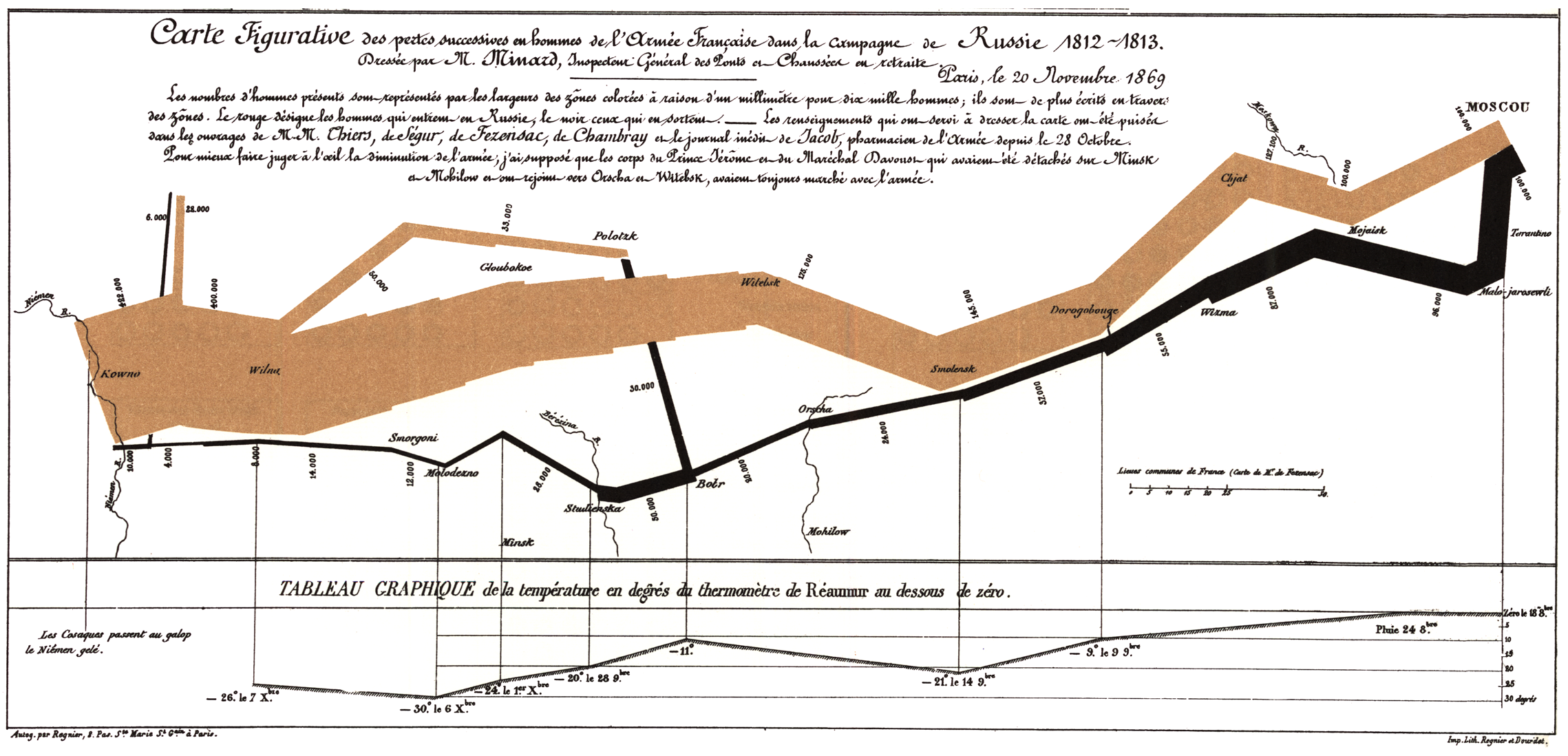
It’s just astonishing how much information is here. The beige line on top accurately shows the number of men relative to its size, starting large at the left and shrinking all the way down to almost nothing when it returns (the light line shows the army advancing, the darker one is the army in retreat). It shows the flanking troops, the rivers they had to cross (where, you’ll notice, rather dramatic changes in line thickness reflect the men lost in those battles.
The graph line on the bottom shows the temperature (which killed far more men than any battle – a pattern repeated when Hitler decided to try the EXACT SAME TACTIC a century and a quarter later. Note to prospective world conquerors: don’t invade Russia during the winter).
And, with nothing more than the facts of the campaign presented in a graphically compelling way, it conveys perhaps the most important piece of information – how utterly devastating and pointless the whole thing was. Napoleon began the campaign with 422,000 men; 4,000 were still alive when he returned. He acquired nothing.
 Charles Minard: one man who figured out the devastating power of facts when presented well
Minard hated war, and by presenting his information this way, he made a genuinely powerful point about the futility of conquest and imperialism. He did not have to editorialize – he simply presented the information accurately and with devastating clarity.
Try doing that with PowerPoint.
(I learned a lot more about effective presentation of information in the Tufte seminar, which I’ll probably revisit at some point. For now, I will close with the obligatory photo of Tom Brady, who could teach Napoleon something about leadership.)
 “Here’s a fact: we engineered the greatest comeback in the history of the world!!”